Tips to Boost Enrollment from Higher Ed Landing Pages
Build Landing Pages That Actually Convert
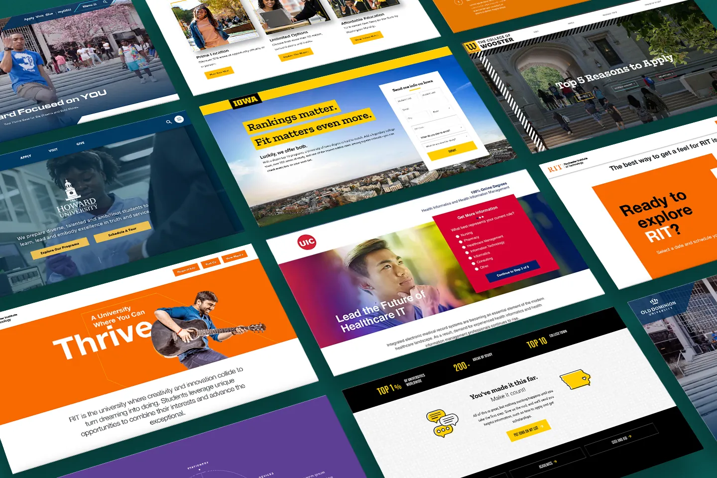
Your landing page is either doing the heavy lifting or it’s just sitting there looking pretty. The truth—most landing pages in higher ed could benefit from improvement. They’re either bloated with too many form fields or so bland they could put coffee to sleep. If you’re trying to boost enrollment, your educational landing pages need to be built to convert.
Students aren’t sitting at desktops anymore. They’re on their phones, swiping through distractions and skipping anything that feels off. You’ve got seconds to hook them.
This guide breaks down what actually works. No fluff, no guesswork—just smart strategies to build landing pages that do their job. Let’s fix the funnel and turn traffic into enrollments.
Why are educational landing pages so important?
Most schools treat their landing pages like a box to tick—basic info, a stock photo, and a “Request Info” button that goes nowhere fast, or an RFI form that’s so full of questions that nobody will complete it. That’s no real strategy. That’s hoping for miracles.
But if we’re being real, your landing page is the front door to your enrollment funnel. If it doesn’t stand out or function properly, you’re losing leads before they ever had a chance to convert.
An effective landing page is built for one thing: action. It speaks directly to the user, makes it simple to engage, and hands off the lead to your enrollment team without delay.
Get Started — Design and Content Best Practices
So, what do you need to do to get started on improving your landing pages and converting more students?
1. Focus on Content Strategies that Convey Educational Value
Your landing page isn’t just a parking spot for program info—it’s your shot to prove your value in seconds. And no, rattling off course titles in a bulleted list doesn’t cut it anymore.
Today’s students want to know: Why should I care? What’s in it for me? Is this school actually worth it?
Your content needs to answer those questions fast—and with authenticity. Think less “brochure copy,” more storytelling.
- Highlight how your programs change lives, not just degrees.
- Use sharp headlines and quick, compelling blurbs.
- Incorporate short video clips, stat highlights, or animated infographics to break things up.
Also, match your tone to the audience. You’re talking to real people, not pushing a PDF. If you’re driving traffic from CTV or social ads, make sure the story continues seamlessly. Same vibe, same energy, same call to action.
2. Optimize Calls to Action for Higher Engagement
Let’s be blunt: “Learn More” is overused. On educational landing pages, your call to action needs to speak directly to the student’s intent and make it easy to say yes.
Think:
- “Find Your Program”
- “Start Your Application”
- “Take the First Step”
- “See What Campus Life Looks Like”
Each CTA should feel like the next natural step, not a leap. Design-wise, make them big, bold, and mobile-friendly (no one wants to fat-finger a tiny button).
And another pro tip? Drop micro-CTAs (little pushes that make the users want to take action) throughout your educational landing pages—not just one lonely button at the bottom. When a visitor feels ready, the action should be right there, waiting for them.
3. Utilize Testimonials and Success Stories as Social Proof
Your landing pages need receipts. Prospects don’t just want to hear what your institution has to say—they want to know what your students say, and it better feel authentic.
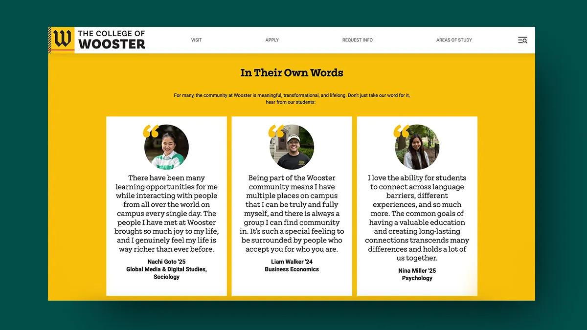
Enter: testimonials and success stories. These aren’t just “nice-to-haves.” They’re proof that your programs deliver. Drop in short, punchy quotes from current students or alumni—especially if they’re working in cool jobs, launching startups, or breaking boundaries.
Better yet? Use video. A 30-second clip of a real student sharing their journey crushes paragraphs of marketing speak.
Placement matters too. Don’t bury these stories at the bottom. Put them near CTAs, beside program descriptions, and anywhere someone might hesitate to click.
Real voices. Real impact. Real conversion power.
4. Leverage Visuals
We hate to break it to you, but your educational landing page engagement might be tanking because of one thing: boring visuals. If your site looks like a stock photo graveyard, students will bounce before your headline finishes loading.
Visuals should feel real, impactful and built for digital-first attention spans. Think short-form videos, dynamic headers, student-driven photography, and subtle animation that pulls the eye—not distracts it.
Already running streaming campaigns? Perfect. Reuse the visuals from your CTV/OTT ads to keep the energy flowing from screen to site. This content works just as hard on your landing page.
5. Add Forms And Calendars
Your educational landing pages could also benefit from forms and calendars. As many of us know, these are helpful when you want to get students to sign up and start the process toward admissions.
The following form from the University of Iowa is an excellent example. It’s short and straight to the point, encouraging students to sign up in return for information on the institution’s courses and options.
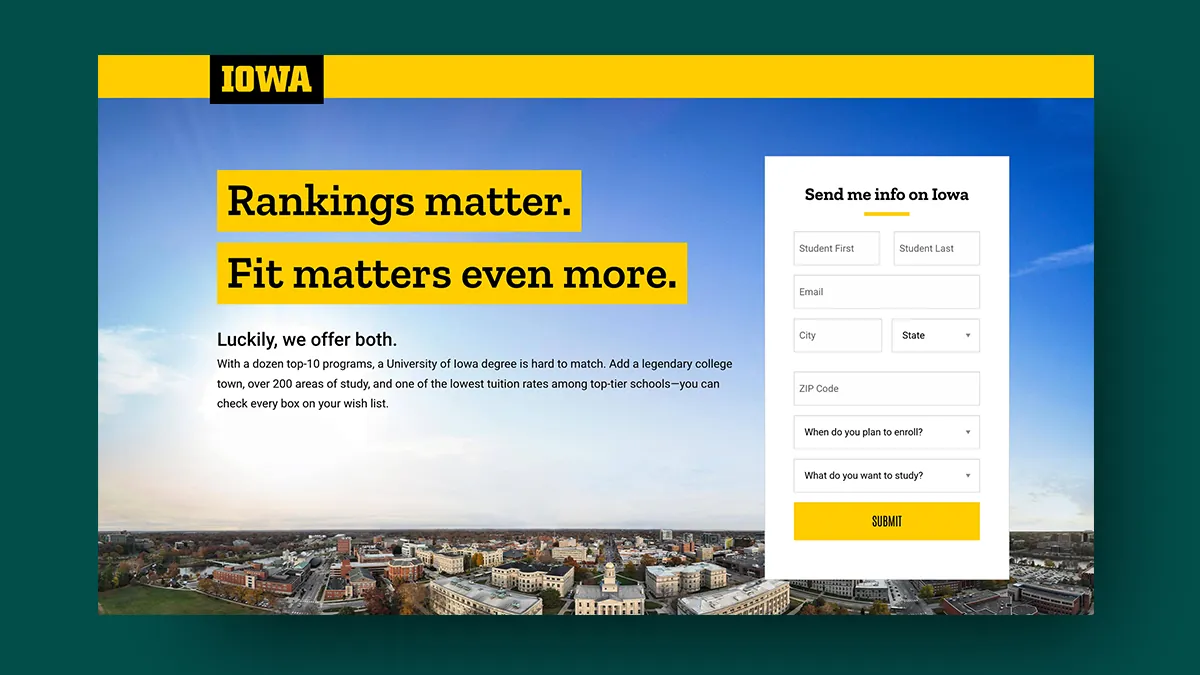
Keeping forms short like this is critical for getting students interested in what you do. Most universities ask prospects to complete dozens of fields, but if you limit it to four or five, you can still collect the information you require to begin the enrollment/marketing process without scaring your prospects away.
Data shows that forms with 3 to 5 fields generate optimal conversion rates on landing pages. Additional fields (6 or more) lower conversions by creating friction. Therefore, keep them to a minimum, make them easy to fill out, and build trust with prospective students by clarifying why they should fill out forms in the first place.
You could also include a calendar on your page to encourage students to schedule campus visits. Here’s an example from the Rochester Institute of Technology:
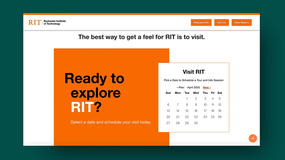
These allow students to book visits and tours right there and then, boosting engagement. After all, educational landing pages are only doing their job if they lead somewhere. And that “somewhere” should be a clear next step: booking a campus tour, starting a chat, or scheduling a virtual info session.
Students need more than inspiration—they need direction. That’s why every landing page should end with a bold invitation: “See it for yourself.”
Consider The User Experience
Once you’ve crafted your landing page, the next step is to think more deeply about the user experience. Your landing page needs to be focused on mobile and built around the business idea of “conversion.”
Remember, you’ve got about 5 seconds to make an impression on your educational landing page. If it feels clunky, corporate, or like it was built in 2012, you’ve already lost them. Gen Z (and Gen Alpha right behind them) expect clean, intuitive design—especially on mobile.
The best educational landing pages ditch the clutter and focus on flow. That means:
- Mobile-first layouts that scroll smoothly on any device
- Sticky CTAs that follow the user as they move
- Short, scannable text blocks with bold headlines
- Visual hierarchy that guides the eye without making them work for it
Fonts too small? Buttons too close together? Info buried in giant, overly wordy paragraphs? Yeah—no one’s sticking around for that.
Design isn’t just about aesthetics. It’s about creating trust, reducing friction, and making sure nothing gets in the way of conversion. Build it with intent, or risk building it for bounce rates.
If you’re not sure about the UX or UI, get teens or some of your own students to test it for you. Then, collect feedback to see what they liked or didn’t like.
A/B Testing And CRO: Testing Landing Pages With Data
Now that your landing page is complete and your enrollment campaign is live, what’s next? Well, if you’re not A/B testing, you’re guessing—and in 2025, that’s just bad marketing. Your education landing page should never be a one-and-done project. Every element is a variable you can tweak and optimize.
You can use A/B testing for different:
- Headlines
- Form lengths
- CTA language
- Hero visuals
- Button colors
The point? Data over gut feelings. A/B testing tells you what your audience actually responds to—not what your team, or in many cases, committee thinks looks best.
And when you’re running Performance TV campaigns, this gets even more important. You’re driving large amounts of high-intent traffic to your page—don’t waste it on a layout that’s not pulling its weight.
Iterate. Improve. Repeat. Your landing page should be evolving constantly to convert at a higher rate.
Conclusion
In summary, creating high-quality landing pages is essential for boosting enrollment and getting students interested in your institution. It encourages sign-ups and gets the process started, allowing you to market to them more consistently and effectively.
At AmbioEdu, we help higher ed teams bridge the gap between storytelling and strategy. From CTV/OTT campaigns to landing pages that convert, we’ve got the tools and the team to make it happen.